
People We Meet On Vacation Front Cover, Back Cover, Spine Design
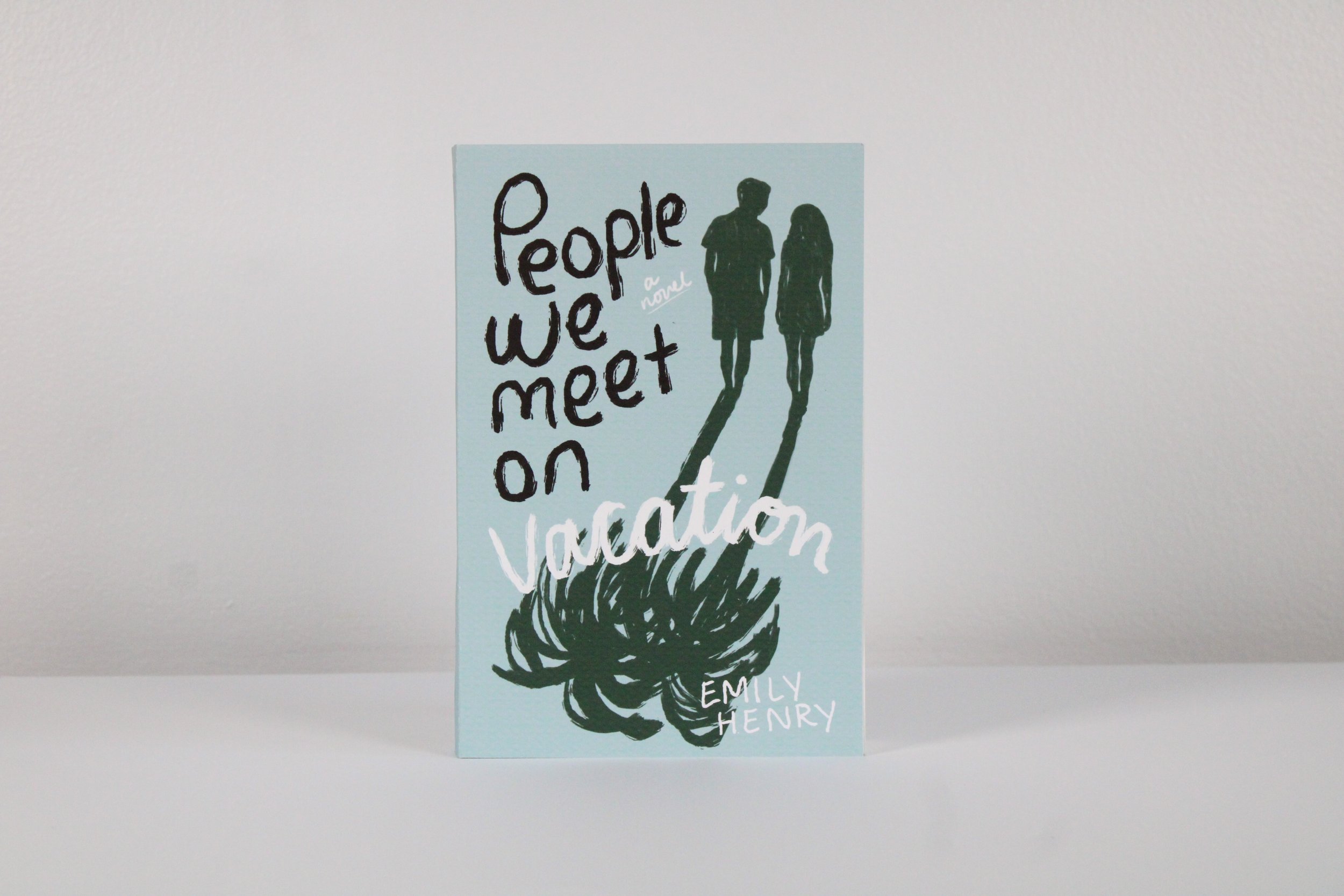
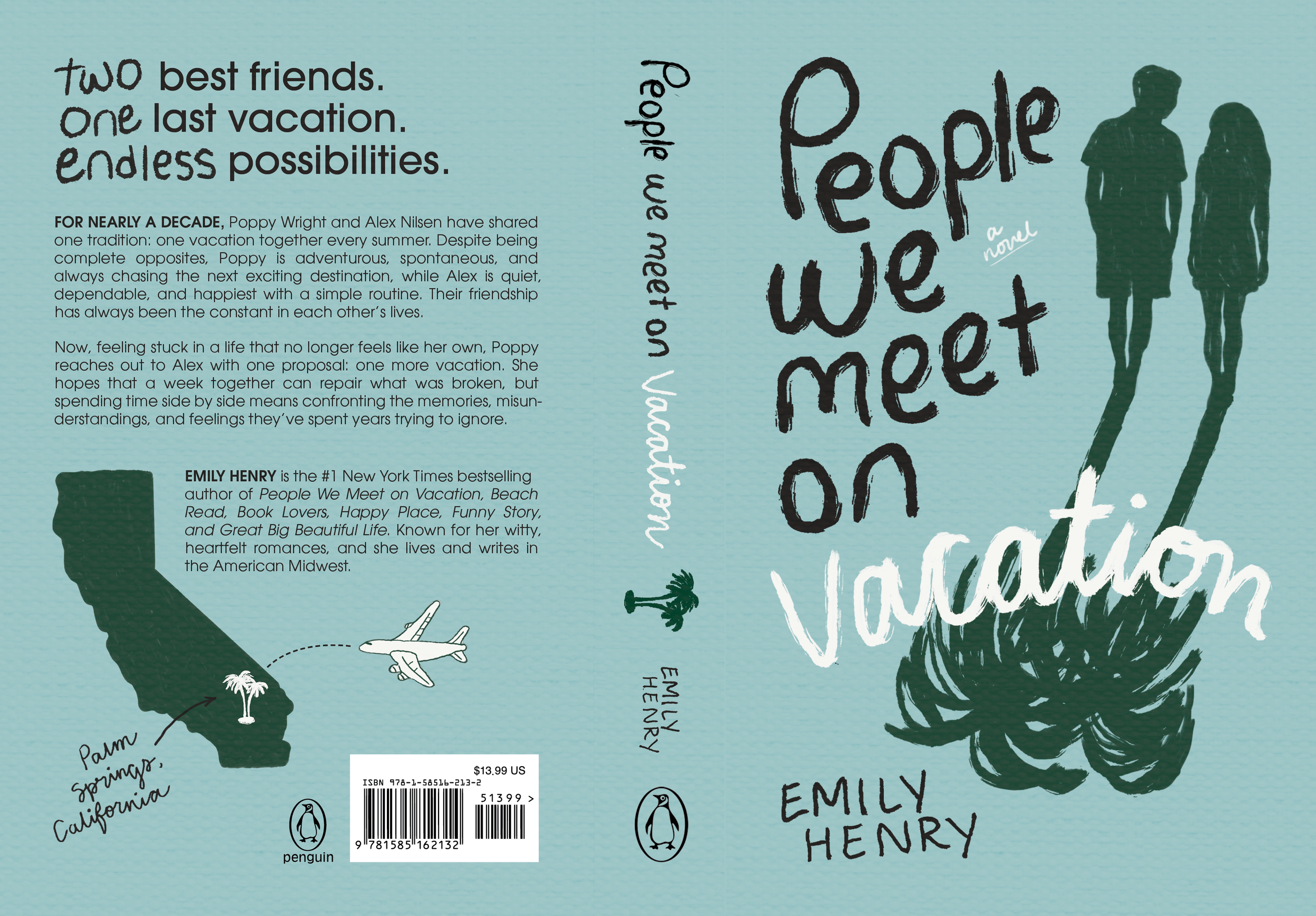
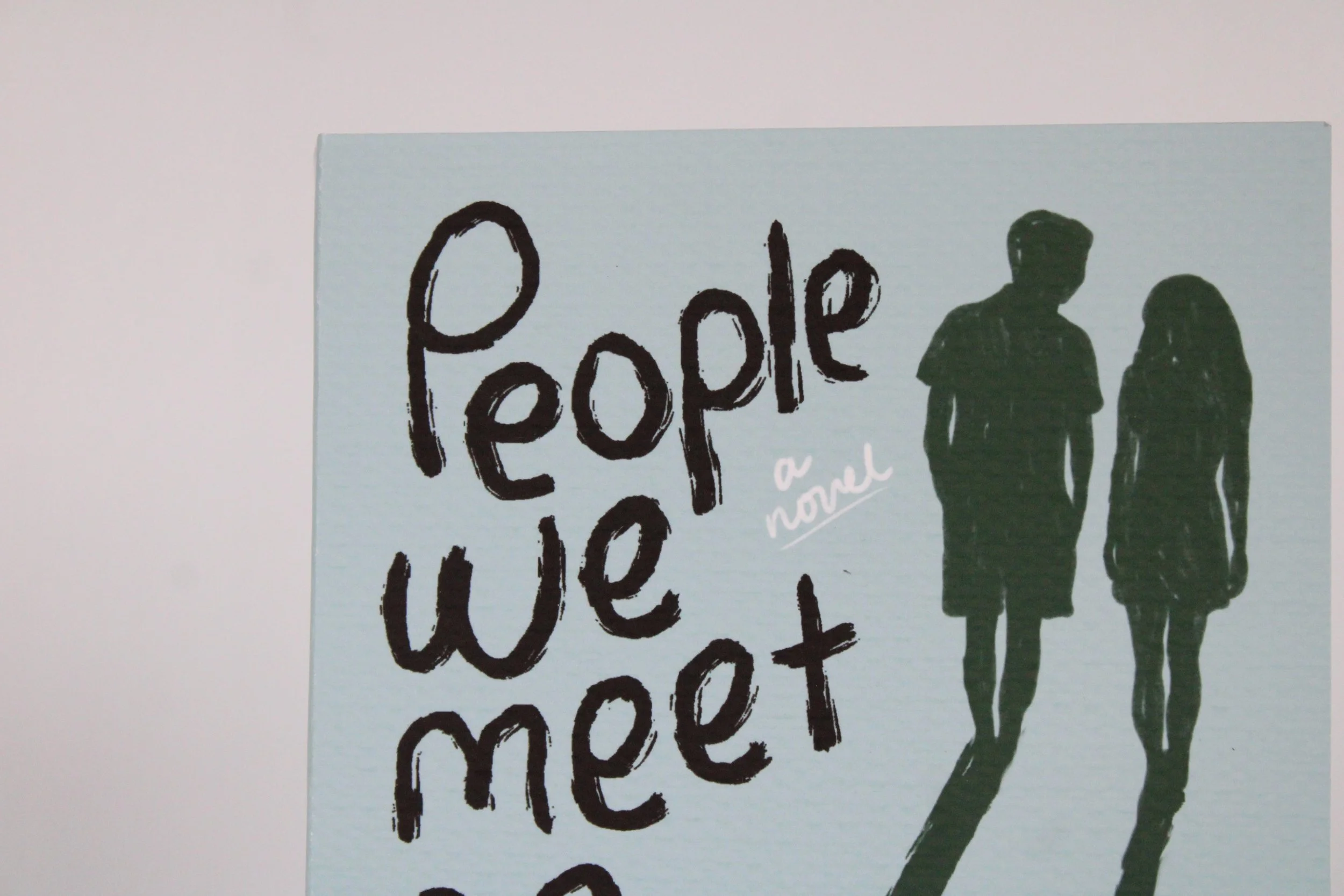
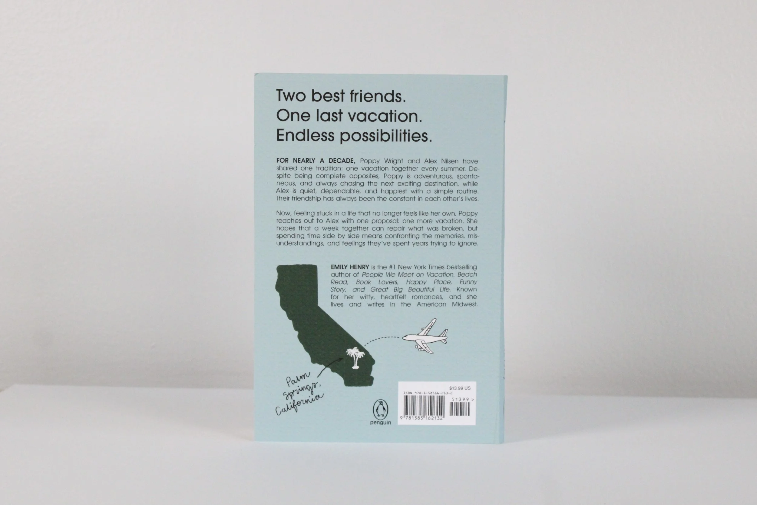
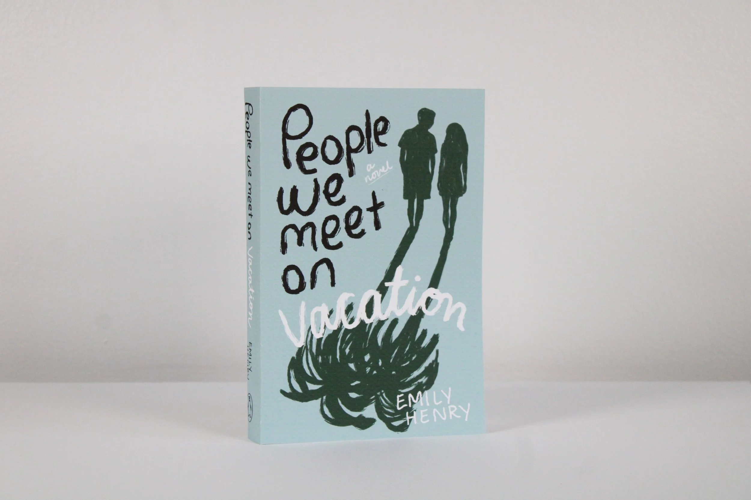
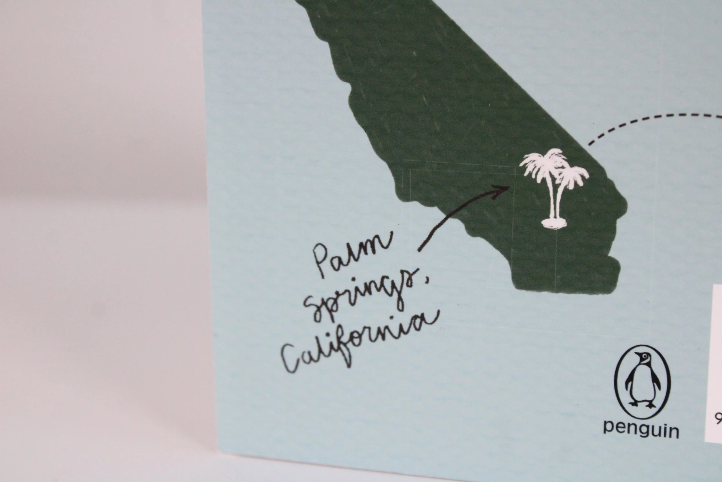
ART316 People We Meet On Vacation Front Cover, Back Cover, Spine Design. For this project, we were asked to create a full mechanical of a fictional book of our choosing using a dual image. I was to create three concept designs, and our class chose which one we believed was most effective for the book. I chose “People We Meet On Vacation”, where the Poppy and Alex are best friends who vacation together each year. I created a dual image of the characters and their shadows cast as a palm tree to symbolize their last vacation spent together and the cheerful ending to the romance book. At the end of the project, I printed the mechanical and produced a physically copy of this book.
Other Concepts Designs:
Concept 1-
The dual image depicts two contrasting beach scenes, similar to what the two friends would see when vacationing in Palm Springs. The left blue side of the concept represents the more adventurous side of vacationing, depicting people surfing amidst the chaos of the ocean. The right pink side represents the more quiet and simple lifestyle Alex chases after, with two people walking on the sand by a calm ocean. The cover colors chosen are meant to show the extreme contrast between the characters and the lifestyles in which they live.
Concept 2-
Since Alex and Poppy vacation to a new place each year, this cover depicts some of the places they have been. Major places they’ve been to include Tuscany, Croatia, Vancouver, New Orleans, and most importantly, Palm Springs, California. In this dual image, each location is depicted on the cover with a mask of the location behind it, leaving Palm Springs with a heart representing where they fall in love. The cover is mainly blue and aqua to represent the beach where the story takes places and the orange to complement the blue.
Concept 1
Concept 2